Reference no: EM132142922
Lab Assignment - MATLAB Matrix, Relational/Logical Operators and Plotting
This laboratory exercise/assignment will involve you 1) practicing multiplication operators in MATLAB; 2) practicing relational and logical operators; 2) writing your own MATLAB script to make basic plots of equations and data. Make sure to comment your code and have good coding manner! Please do write your answers legibly. Thanks.
Part I: Matrix multiplication and ordering of elements
1) Here we have matrix 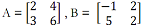
Calculate the following:
A*B =
B*A =
A.*B =
B.*A =
2) Matrix 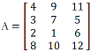 , using all the elements of A,
a) Reshape matrix A to a new matrix, named B1 with two rows and six columns. Please write down the MATLAB command, and write down matrix B1.
>>
B1 =
b) Reshape matrix A to a new matrix, named B2 with six rows and two columns.
>>
B2=
Part II: Relational and logical operators
In recent weeks, you've heard about the hurricanes, for example, Hurricane Florence. The so-called Saffir-Simpson Hurricane Wind Scale is a 1 to 5 rating based on a hurricane's sustained wind speed. This scale estimates potential property damage. See the below Hurricane category table, adapted from National Hurricane Center. Use the MATLAB relational and logical operators (hint: if-elseif-else statement) to write a MATLAB code file (.m) to determine for a given wind speed of a hurricane, which category the hurricane is and what damage has. You need to first name a variable, "WindSpeed" to denote the wind speed, a variable "HurricaneCategory" and a variable named "Damage" to denote the category (from 1 to 5) and denote damage at landfall (listed in the table). Refer to Lecture Note 05.
|
Category
|
Wind speed (mph)
|
Damage at landfall
|
|
1
|
74-95
|
Minimal
|
|
2
|
96-110
|
Moderate
|
|
3
|
111-129
|
Extensive
|
|
4
|
130-156
|
Extreme
|
|
5
|
>=157
|
Catastrophic
|
You can copy/paste your codes here. Or print and attach the file you wrote.
Part III: Plotting of Equations
One of the reasons that so many scientists (including geoscientists) use MATLAB is because of its built-in plotting functions. Thus, with MATLAB, you can do mathematical calculations and visualize the results all in a single, easy-to-use language. You may start the first MATLAB script that plots a basic equation.
1) Here we first use the conversion from Fahrenheit to Celsius as one example. Follow the instructions below. Please include comments for the lines you wrote.
a) Create a new MATLAB script (TempConvertF2C.m) in your directory (either Q:\ if you are using UMKC remote lab, or any directory you may prefer). In the first few comment lines, include your name, your UMKC ID, and the date you created the code.
b) The temperature T in degrees Celsius (oC) is equal to the temperature T in degrees Fahrenheit (oF) minus 32, times 5/9: C = (F- 32) × 5/9
Copy/paste the MATLAB script that plots this equation.
Run your code (give a value to F) in MATLAB to fill out the following table.
|
0 oF
|
oC
|
|
70 oF
|
oC
|
|
100 oF
|
oC
|
2) Let's move on and look at a relatively complex example and do some plotting as well.
a) The general form of a sinusoid with an amplitude, A, and a wavelength, λ is given by:
y = A * sin(2πx/λ)
b) Write a MATLAB script that plots this equation for a single wavelengths and amplitude. Some guidance is provided below.
c) Remember that MATLAB can't plot equations. It can only plot data, so you will have to first make the data before you can plot anything. The first step is to make variables for A, x, y, and λ. Set the amplitude A to 2 and the wavelength λ to 24. Make your independent variable, x, go from 0 ≤ x ≤ 3λ and have 1,000 total data points. When making your data, make sure to use an efficient MATLAB command (hint: "linspace", please check our lecture notes or "help linspace" in MATLAB) for generating a large list of numbers.
d) Now, that you have x-values stored (hopefully in a variable/vector called "x"), you can now use the sinusoidal equation given above to calculate the y-values. Store these in a variable/vector called "y". Note that "x" and "y" should have the same dimensions if you did everything correctly.
e) Now that you have your x and y data all created, make a plot of the results. Put x as the x-axis, and y as the y- axis. In your plot, use the following formatting:
- The equation should be plotted with a dashed green line
- The x-axis should be labeled "Time (hours)"
- The y-axis should be labeled "Temperature Change (Degree C)"
- The plot should have the following axis ranges, for the x-axis: 0 ≤ x ≤ 3λ; and for the y-axis: -1.2A ≤ y ≤ 1.2A and the appropriate formatting command should only directly reference your A and λ variables. This makes your code more general and easier to modify for different amplitudes or wavelengths.
Please copy/paste your MATLAB script here. And save your plotting as a .png file and copy it here or attach it.
Part IV: Plotting data, subplotting and save plotting
MATLAB is also very good at handling numerical data (even when the quantity of data is super large, which is true for Geosciences data).
1) Subplotting
In this example, you'll read the data and do multiple plotting in the same figure to draw the climograph of Kansas City, i.e., the long-term monthly (from January to December) mean of surface air temperature and precipitation separately. Follow the instructions below.
a) The following table shows you three columns, first column: calendar month from January to December; second column: surface air temperature for each month (unit: F); third column: precipitation accumulated for each month (unit: inch).
1 29.3 1.13
2 35.2 1.02
3 45.9 2.38
4 56.5 3.27
5 66.6 4.55
6 76.1 4.73
7 81.3 3.61
8 79.5 3.62
9 70.6 4.17
10 59.0 3.28
11 44.8 2.30
12 33.6 1.45
b) First save the above data into a file named KCdata.txt
c) Read the above data in MATLAB (hint: using load command), then define three variables: month, temperature, precipitation and read each column of the variable KCdata (Here you may use the command "whos KCdata" to see the dimension, which should be 12*3). Now you have all the three variables created and values stored.
d) Make a plot with two subplot.
The upper panel should be a line plot, showing the annual cycle of the temperature, with x-axis as calendar month and y-axis as the temperature. In this plot, use the following formatting:
- The plot should be plotted with a solid red line
- The x-axis should be labeled "Months"
- The y-axis should be labeled "Temperature (Degree F)"
- Title should be "KC Temperature"
The lower panel should be a bar graph, showing the annual cycle of the precipitation, with x-axis as calendar month and y-axis as the precipitation. In this plot, use the following formatting:
- The plot should be plotted with a bar graph.
- The x-axis should be labeled "Months"
- The y-axis should be labeled "Precipitation (inch)"
- Title should be "KC Precipitation"
Please copy/paste your MATLAB script here or attach it. And save your plotting as a .png file and insert it here or attach it.
2) Multiple plotting using the same axis
In this example, you'll read the data and do multiple plotting using the same axis to draw the monthly (from January to December) mean surface air temperature for New York City and San Francisco in the same figure. This type of figure is normally used for comparison purpose. Follow the instructions below.
a) The following table shows you three columns, first column: calendar month from January to December; second column: surface air temperature for each month (unit: F) for New York City; third column: same as the second column but for San Francisco.
1 32.6 49.4
2 34.8 52.4
3 42.3 54
4 52.2 56.2
5 62.4 58.7
6 71.5 61.4
7 77.1 62.8
8 75.9 63.6
9 68.6 63.9
10 57.7 61
11 47.6 54.7
12 37.9 49.5
b) First save the above data into a file named Temp_NYC_SFO.txt
c) Read the above data in MATLAB (hint: using load command), then define three variables: month, temperature at NYC, and temperature at SFO and read each column of the variable Temp_NYC_SFO. Now you have all the three variables created and values stored.
d) Make a plot with annual cycle of temperatures at NYC and SFO at the same axis, with x-axis as calendar month and y-axis as the temperature. In this plot, use the following formatting:
- NYC should be plotted with a solid red line with marker "circle", blue edge color, magenta face color, marker size 4. SFO with a dashed green line with marker "diamond", black edge color, cyan face color, marker size 8.
- The x-axis should be labeled "Months"
- The y-axis should be labeled "Temperature (Degree F)"
- Title should be "NYC vs. SFO"
- Put a legend on top left corner to present "NYC" and "SFO"
- With grids lines
- The x-axis limit should be set from 0.5 to 12.5 and y-axis limit should be set from 25 to 80 F.
- Bonus: Display tick marks along the x-axis at the values 1, 2, ..., 12. Then specify a label for each tick mark as Jan, Feb, ..., Dec (3-letter abbreviation for each month).
Please copy/paste your MATLAB script here or attach it. And save your plotting as a .png file and insert it here or attach it.