Reference no: EM132382457
Assignment - Charts, Graphs, and Frequency Plots
To complete this assignment you must submit an electronic copy. Download the starter file and save the file under the name CS1100.LastName.A7 and where LastName is your last name.
Knowledge Needed - This lab requires the following Excel functions and techniques:
- Cell ranges, borders, shading, cell formatting, number formatting
- Excel charts, graphs, and plots
- FREQUENCY array function
- MIN, MAX, SUM, AVERAGE functions
- Excel help and online documentation
Background -
The Quality Assurance team at Ravix Interactive has been asked to publish a report of their current activities and provide insights into the quality of software that is deployed at Ravix. To help communicate they decide to build various charts, plots, and graphs.
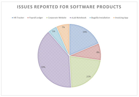
Problem 1 - The worksheet "Defects by App" lists different applications in use at Ravix and the current number of issues reported with those applications. Create a Pie Chart showing the open issues by application. Format the chart as shown below. The display of the percentages may differ depending how the chart is sized. Approximate the colors and don't worry about the "stipple" pattern -- you do not have to reproduce that; it is an artifact of the screen snapshot.
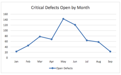
Problem 2 - The worksheet "Open Defects" shows the open defects for a few months. Create a Marked Line graph showing the trend of open defects from month to month. Use the graph below as a reference of what the result should look like:
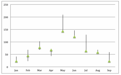
Problem 3 - The worksheet "Defect Range" contains the number of open issues per month as triple: the highest number of open issues in a month, the lowest number, and the number at the close of the month. Create a High-Low-Close plot like the one shown here:
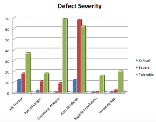
Problem 4 - The worksheet "Defect Severity" lists open issues categorized by level of severity for the applications in use at Ravix. Create a Clustered column chart similar to the one shown below:
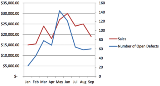
Problem 5 - The worksheet "Defects by Sales" shows the number of defect per month as well as the sales for that month. Create a Line Graph for this data. Use a secondary axis to help show how these two variables interact.
Problem 6 - The worksheet "Grades" shows grades in CS1100. To better understand the data, the instructor has asked for a frequency distribution (histogram) of the grades.
Follow these steps to create the frequency plot:
1. Create a named range for the grade data in cells B4 to B87. Name the range "GradeValues".
2. Create a bins array and letter grades in cells D4:E 15 based on the following:
X > 93 A
90 < X <= 93 A-
87 < X <= 90 B+
83 < X <= 87 B
80 < X <= 83 B-
77 < X <= 80 C+
73 < X <= 77 C
70 < X <= 73 C-
67 < X <= 70 D+
63 < X <= 67 D
60 < X <= 63 D-
X <= 60 F
Use the FREQUENCY function to count the number of values in each bin interval. Recall that the steps to enter the FREQUENCY array function are:
1. Select the range of cells that will hold the result of the FREQUENCY function.
2. Type in =FREQUENCY( ... ) with the correct arguments - you need to figure this out!
3. When done entering the function, press CTRL+SHIFT+ENTER on Windows and MAC 2016 for older Excel version on a Mac enter COMMAND+RETURN.
Create a column chart from the frequency data.
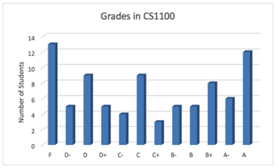
Hints: Investigate the menus and the "Chart Properties" for ways to customize charts, particularly markers.
Attachment:- StarterFile.rar