Reference no: EM131436218
Part A -
During the 2014-2015 soccer season, 20 teams competed with each other in the Serie A soccer league of the Italian Football Federation. Each team played 38 games, half at home and half away. A winning team earns three points, a losing team does not earn any points, and each team earns one point in the case of a draw. The dotplots below show the total home game points and total away game points of the 20 teams in Serie A in 2014-15.2 Use these dotplots to help you answer the questions below.
1. Juventus, the Serie A champion in 2014-2015, won 16 games and had 3 draws in home games (without any losses). Compute the total points of Juventus in home games and circle it in the dotplot above.
2. One way to compare distributions is by describing the centers of the data sets. The center can be viewed as a typical value that could be used to represent the data.
A. Pick a typical number to represent the home game points.
B. Pick a typical number to represent the away game points.
C. Circle the typical number in each dotplot.
D. Is the typical number of points you chose for home games higher, lower, or about the same as the typical number of points for away games in the Serie A season?
3. Another way to compare distributions is to describe the spread. The spread refers to how scattered the values are, or how much variation there is. Spread may indicate an interval of numbers which contains the most usual values.
A. Where do most of the numbers lie for home game points?
B. Where do most of the numbers lie for away game points?
C. Mark the range of values you selected in each dotplot.
D. Is the range you selected noticeably shorter for one dotplot?
4. In addition to center and spread, you can also use descriptions of shape. Shape describes the patterns you see in the data. How would you describe the shape of each dotplot?
5. Imagine that a group of researchers have studied the soccer data from the 2014-2015 Serie A season. They have written the following paragraphs comparing the points earned in home games versus away games. Read the paragraphs, and then follow the instructions below.
Our goal was to determine if there is a difference between the points earned during home games and away games. We compared the number of points earned by each team in both home and away games.
We found that the distribution of points earned differed. The typical number of total points obtained by a team in home games was close to 30. This was larger than the typical number in the away games, which was around 20. Of course, there was also variability in points earned in home versus away games. However, there was no noticeable difference in the spread of the two distributions, both with a range of about 30-35 points. The shapes were not identical but both had slightly longer tails on the right side and there was a peak near the 20-point mark in the away games. The points in home games were closer to be symmetric. Moreover, there was an outlier in the home game points.
We observed that team performance in Serie A was better in home games than in away games during the 2014-2015 season. So we can conclude that there was a home field advantage.
These paragraphs are an example of a thorough, or complete, description of a statistical study. In particular, they illustrate how to use descriptions of center, spread, and shape to compare data sets and draw a conclusion.
A. What type of study is this (observational study or experiment)?
Look back at the paragraphs describing the study and identify the following:
B. The research question being investigated.
C. The measure used to define what data are collected.
D. The use of center in the data analysis.
E. The use of spread in the data analysis.
F. The use of shape in the data analysis.
G. The conclusion drawn from the data analysis.
Part B -
1. We can choose different bin widths when creating frequency distribution tables and histograms. Here are two examples of different bin widths for the scores from away teams:
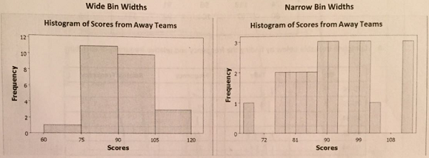
A. What is the bin width for each of the histograms?
B. Compare these histogram to the histogram with bin width of 10 points that we created in the lesson. Explain the problem with too many or too few bars. Think about looking for shape, center, spread and outliers in the data as you answer the question.
2. Here is a list of scores from the corresponding sample of home teams.
Sample of Scores from Home Teams
95 97 74 100 99
102 78 89 87 79
86 88 91 105 105
74 118 96 91 93
80 97 104 92 111
A. Complete the table below by finding the frequency and relative frequency of each bin.
|
Bin
|
Tally
|
Frequency
|
Relative Frequency
|
|
70-74
|
|
|
|
|
75-79
|
|
|
|
|
80-84
|
|
|
|
|
85-89
|
|
|
|
|
90-94
|
|
|
|
|
95-99
|
|
|
|
|
100-104
|
|
|
|
|
105-109
|
|
|
|
|
110-114
|
|
|
|
|
115-119
|
|
|
|
B. Draw the frequency histogram on the graph below.
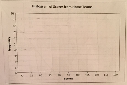
C. In how many games did the home team score at least 100 points?
D. Explain in your own words what you think the height of the second bar tells us.
E. Describe the center, shape, and spread of the frequency distribution.
3. Now let's compare the score for away teams and the scores for the home teams in this sample. Below are the histograms for each data set:
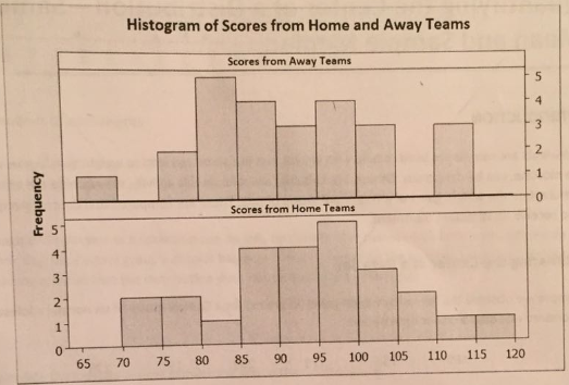
Do the graphs seem to indicate that playing at home has an impact on teams' scores? Make sure to compare the two distributions in terms of centre, spread, and shape.
Part C -
1. The table below lists average monthly temperatures in St. Louis and San Francisco.
|
|
Jan
|
Feb
|
Mar
|
Apr
|
May
|
Jun
|
Jul
|
Aug
|
Sep
|
Oct
|
Nov
|
Dec
|
|
St. Louis
|
29.9
|
33.9
|
45.1
|
56.7
|
66.1
|
75.4
|
79.8
|
77.6
|
70.2
|
58.4
|
46.2
|
33.9
|
|
San Francisco
|
51.1
|
54.4
|
54.9
|
56.0
|
56.6
|
58.4
|
59.1
|
60.1
|
62.3
|
62.0
|
57.2
|
51.7
|
These data are summarized in dotplots below.
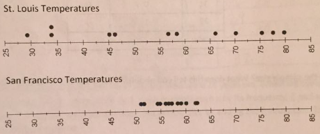
A. Compute the sample mean of the typical monthly temperatures for both St. Louis and San Francisco. Use the symbols x- and y- for these sample means.
B. Compute the sample medians of the monthly temperatures for both St. Louis and San Francisco.
C. Now, write s brief comparison of the sample means and sample medians for the two cities. In a comparison, you should explain what is the same and what is the different about the weather in the two cities with regard to their means and medians.
2. Students in a Statistics course took a test where the highest score was 100. Most of the students did quite well, with more than half of the students getting As and Bs on the test. Most of the rest of the students earned Cs, with just a few Ds. Only two students received Fs, but their scores were very low, in the 30s.
A. If As are for scores in the 90s, Bs for the 80s, Cs for the 70s, Ds for the 60s, and Fs for scores below 60, what is the shape of the distribution of scores?
B. Is the mean likely to be greater than or less than the median? Explain your answer.
C. Students frequently want to know the "average" test score. What measure of center should the professor share with the class, the mean or the median? Think about which measure will give a better representation of typical student scores. Give a reason for your answer.
3. A frequency distribution for the ages of students in a Statway class is given below.
|
x = age
|
f = frequency
|
F · x
|
|
18
|
4
|
72
|
|
19
|
5
|
|
|
20
|
7
|
|
|
21
|
3
|
63
|
|
22
|
4
|
88
|
|
23
|
2
|
|
|
24
|
0
|
|
|
25
|
1
|
25
|
|
26
|
1
|
|
|
Totals:
|
|
|
A. Fill in the missing values in the table and compute the mean age of the students. Use the proper symbol.
B. Plot the sample mean on the horizontal axis of the histogram below.
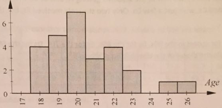
C. Is the mean likely to be greater than or less than the median? Explain your answer.