Tabulation of raw data and graphical representation
Statistics: The process of collection of data with a specific purpose and to answer the question is called statistics.
Or
The process of drawing facts from numerical data. It includes the collection of the data, presentation of the data and Interpretation of the data.
Observations: Information in the form of numerical figures are called observation.
Statistical Data and Collection: The facts collected for the purpose of investigation is called statistical data.
There are two types of data:
(i) Primary data
(ii) Secondary data.
Primary data: The data-collected by the investigator for the first time for his own use.
Secondary data: The data collected by a secondary source other than the investigator e.g.
Raw data: The data obtained from the original source but not arranged properly is called "Raw Data".
Array: Raw data does not provide any useful information but it creates confusion. The data in the above form is called 'ungrouped data'. An 'array' is an· arrangement of raw numerical data in he ascending or descending order of magnitude.
Grouped data: Data can be placed systematically in groups or categories.
SOME FACTS
Variate: The quantity that may vary from observation to observation is called a variate.
Range: The difference between the maximum and minimum observations is called range.
Class-interval: Datas are divided in groups, each group is called an interval or class i.e., the upper limit and lower limit of a class constitutes a class-interval. It is also called as class-size.
Class-limit: Every class-interval has two limits. The smallest observation of the interval is called lower limit and the largest observation of the interval is called upper limit.
Class-size: The difference between the upper and lower limits of interval is called class-size or the difference between two successive class-marks is called class-size.
Class-mark: The mid-value of the class is called its class-mark.
Frequency: The count of tally marks or the number of observations in a particular class is called its frequency.
Class-frequency: The corresponding -frequency of a class is called its class frequency.
Frequency distribution table: Such a table in which the frequencies are distributed in many classes is called frequency distribution.
Cumulative frequency: The cumulative frequency of a class is the sum of all frequencies prior to that class.
Exclusive method: In this method, the upper limit of each class is the lower limit of the next class.
Inclusive method: In this method, the upper limit of none of the classes is the lower limit of the next class.
For example: The classes in this method will be of the type: 0-4, 5-9, 10-14, 15-19, 20-24, 25-29.
Presentation of Data: to convert a -aw or an ungrouped data into grouped data.
Step 1. Determination of the range.
Step 2. Fixation of Class-interval: There is not hard and fast rule of
determining the number of classes. It is advisable to have total number or classes between 5 and 15.
Step 3. Fixation of Class-size:
Divide the range by the desired number of classes to determine the approximate size of the class interval.
Step 4. To find Class-limits. Classes should not be overlapping. There should be no gaps between the classes.
Classes should be of uniform (or same) size.
Open ended classes, for example less than 5 or more than 10 etc. should not be used.
We take each observation from the data one at a time and place a tally mark 'l' opposite the class to which the item belongs by cuting the numbers from the data.
The counting of tally marks in a particular class tells the frequency of that class. The sum of all the frequencies should be equal to the total number of observations.
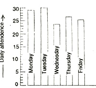
Diagrammatic Representation:
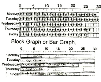
Column Graph: In both the bar graph and column graph, the bars or columns are equally wide.
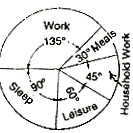
The pie diagram is a circle divided into sectors by drawing radii.
The central angle of a sector will be proportional to the time for the corresponding item.
There is not need to enter the measurement of each angle.
Histograms: Histograms is a graphical representation of the frequency distribution of a continuous variable. In the construction of histograms, class-intervals of continuous data are taken on X-axis and then rectangle of appropriate height such that area of the histogram is equal to the frequency of that class interval are erected over them.
\ Height of rectangle
class frequency/width of the class interval
If the width of all the class intervals is the same then the height of the rectangles can be taken in proportion to the frequency.
The total area covered by the "histograms for whole frequency distribution is equal to the total number of items in he frequency distribution.
Frequency polygon: Frequency polygon is obtained by joining the midpoints of the respective tops of the rectangles in the histogram. The end points are extended at each end to join the x-axis. The area of the graph between the x-axis and the two extreme ends of the curve is equal to the total frequency of the data. In a frequency the value of x-corresponding to highest point in the polygon will be equal to the mode.
Note: To complete the polygon, the mid-point at each end is joined to the mid-point of the immediately lower or higher imagined class interval as the case may be at zero frequency. Note that this ensures that the total area of a frequency polygon is the same as that of the corresponding histogram.
Cumulative frequency curve or ogive: Just as a histogram of a frequency polygon is graph of frequency distribution, cumulative frequency curve or an ogive is a graph of cumulative frequency distribution.
Less than ogive: In case of a grouped frequency distribution, cumulative frequency curve is the free hand smooth curve drawn through the point which have the upper limits of the class-intervals as abscissae and their corresponding cumulative frequencies as ordinates.
More than ogive: It is a free hand smooth curve drawn through the points which have the lower of the class intervals as abscissa and their corresponding cumulative frequencies as ordinates.
Velocity-time graphs: When the velocity remains constant (no acceleration).
When velocity changes in a non uniform way (non-uniform acceleration).
In a velocity-time graph, the area enclosed by the velocity-time curve and the time axis gives the distance travelled by the body.
Velocity-time graph when velocity changes at a uniform acceleration: A straight line sloping upwards shows uniform acceleration, whereas a straight line sloping downwards indicates uniform retardation.
Velocity-time graph when acceleration is non-uniform: Here also the distance travelled is given by the area between the velocity-time graph and the time axis.
Distance/Displacement-time graph: The slope of a distance-time graph indicates velocity. The velocity of the body is non-uniform, then the graph between distance and time is a curved line called a parabola as shown in the figure.
TEMPERATURE SCALES
Fahrenheit scale: On it, the lower fixed point is taken as 32° and the upper fixed point is taken as 212°, so that there are 212-32 = 180 equal divisions between two fixed temperatures.
Celsius scale: On it, the lower fixed point is taken as 0° and the upper fixed point is taken as 100°, so that there are 100 - 0 = 100 equal divisions between two fixed temperatures.
On comparing these two scales, we find that
0°C = 32°F
and 100°C = 212°F
Relationship between Fahrenheit and Celsius Scales of Temperatures.
From Fahrenheit to Celsius scale C = 0.556 × (F - 32)
From the Celsius temperatures into
Fahrenheit scale F = 1.8 C + 32
where F = Temp. on Fahrenheit scale C = Temp. on Celsius scale.
Live Math Experts: Help with graphical representation Assignments - Homework
Expertsmind.com offers help with graphical representation assignment and homework in mathematics subject. Experts mind's math experts are highly qualified and experienced and they can solve your complex graphical representation math problems within quick time. We offer email based assignment help -homework help service in all math topics including graphical representation .
Math Online Tutoring: graphical representation
We at Expertsmind.com arrange instant online tutoring session in graphical representation math topic. We provide latest technology based whiteboard where you can take session just like live classrooms. Math experts at expertsmind.com make clear concepts and theory in graphical representation Math topic and provide you tricky approach to solve complex graphical representation problems.